Financial Nordic June 3, 2020

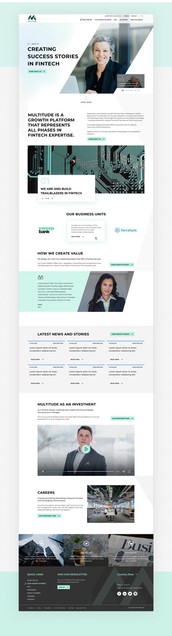
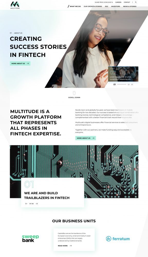
Evolving a design language

The Multitude.com website is technically outdated. It is built on old, slow and inflexible CMS that is not supporting needs of modern digital company. The Multitude frontend has experienced 3 separate face lifts that has created inconsistencies in both the visual and written storytelling.

Task

Create a design language based on new brand guides, making it more modern and more attractive to their target audience groups.

Brand absorbstion

Concept themes


Brutalism

Use of big impact text to catch the user's eye to the most important and relevant section of the website

Gradient

The subtle use of gradient to highlight elements or sections

White space

Effective use of white space helps the design to get the message through the user quickly and increase the probability of interaction by highlighting the CTAs

Dynamism and fluid layout

A concept that adds life to the design and guiding the user's eye in the project in an infinite experiment

Client feedback

Developing their design language

Re-thinking
‘peaks & troughs’

3 key comments centred around conversations with 2 key stakeholders who asked if they’d be restricted image wise with such a narrow space for impactful imagery.


Taking into account the scope of this project: Who, how and how many images will be required – our clients are time-poor as a team and might not be able to commit to maintaining the look & feel.

I took their valid concerns and applied that point over my approach to developing their design language. Our major vehicle for ‘dynamism’ relied heavily on a double-sided diagonal mask shape – the peaks & troughs of the logo.

The evolved
design language

Refined & finalised design language

Design solutions

Lorem ipsum dolor sit amet, consectetur adipiscing elit. Faucibus eget ullamcorper curabitur facilisi. Lacus in egestas felis, non arcu, felis sed pellentesque ullamcorper. Urna urna sed in dui sem. Vivamus pellentesque elementum volutpat imperdiet consectetur mauris..

Lorem ipsum dolor sit amet, consectetur adipiscing elit. Faucibus eget ullamcorper curabitur facilisi. Lacus in egestas felis, non arcu, felis sed pellentesque ullamcorper. Urna urna sed in dui sem. Vivamus pellentesque elementum volutpat imperdiet consectetur mauris..

I took their valid concerns and applied that point over my approach to developing their design language. Our major vehicle for ‘dynamism’ relied heavily on a double-sided diagonal mask shape – the peaks & troughs of the logo.

Evolved look & feel

Before After

Defining the
component library


Design system
and component functionality

Lorem ipsum dolor sit amet, consectetur adipiscing elit. Faucibus eget ullamcorper curabitur facilisi. Lacus in egestas felis, non arcu, felis sed pellentesque ullamcorper. Urna urna sed in dui sem. Vivamus pellentesque elementum volutpat imperdiet consectetur mauris..

Lorem ipsum dolor sit amet, consectetur adipiscing elit. Faucibus eget ullamcorper curabitur facilisi. Lacus in egestas felis, non arcu, felis sed pellentesque ullamcorper. Urna urna sed in dui sem. Vivamus pellentesque elementum volutpat imperdiet consectetur mauris..

I took their valid concerns and applied that point over my approach to developing their design language. Our major vehicle for ‘dynamism’ relied heavily on a double-sided diagonal mask shape – the peaks & troughs of the logo.

Back

Leave a Reply

Your email address will not be published.

This website stores cookies on your computer. Cookie Policy