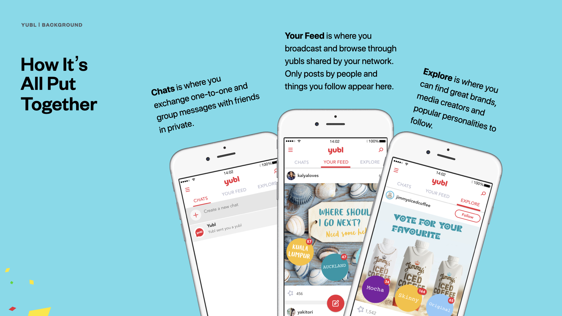
In 2015, Yubl was a UK-based social messaging startup trying to carve out a space in a market dominated by WhatsApp, Snapchat, and Facebook Messenger. Founded by Jonathan Ellis, a British entrepreneur known for co-founding Psygnosis and helping launch the original Sony PlayStation, the venture had serious ambitions. Its big idea was to go beyond basic texting by letting users create interactive posts – polls, count buttons, live location sharing, and link buttons. This offered people new ways to connect and gave brands a direct channel for creative engagement. I joined the Yubl team as a UI Designer & UX Researcher during the frenzy of pre-launch, excited by the chance to help shape this product from the ground up.
Task
Design and deliver the interface for a new social messaging app - creating a visual language, defining interaction patterns, and embedding user research in a fast-moving startup pre-launch.
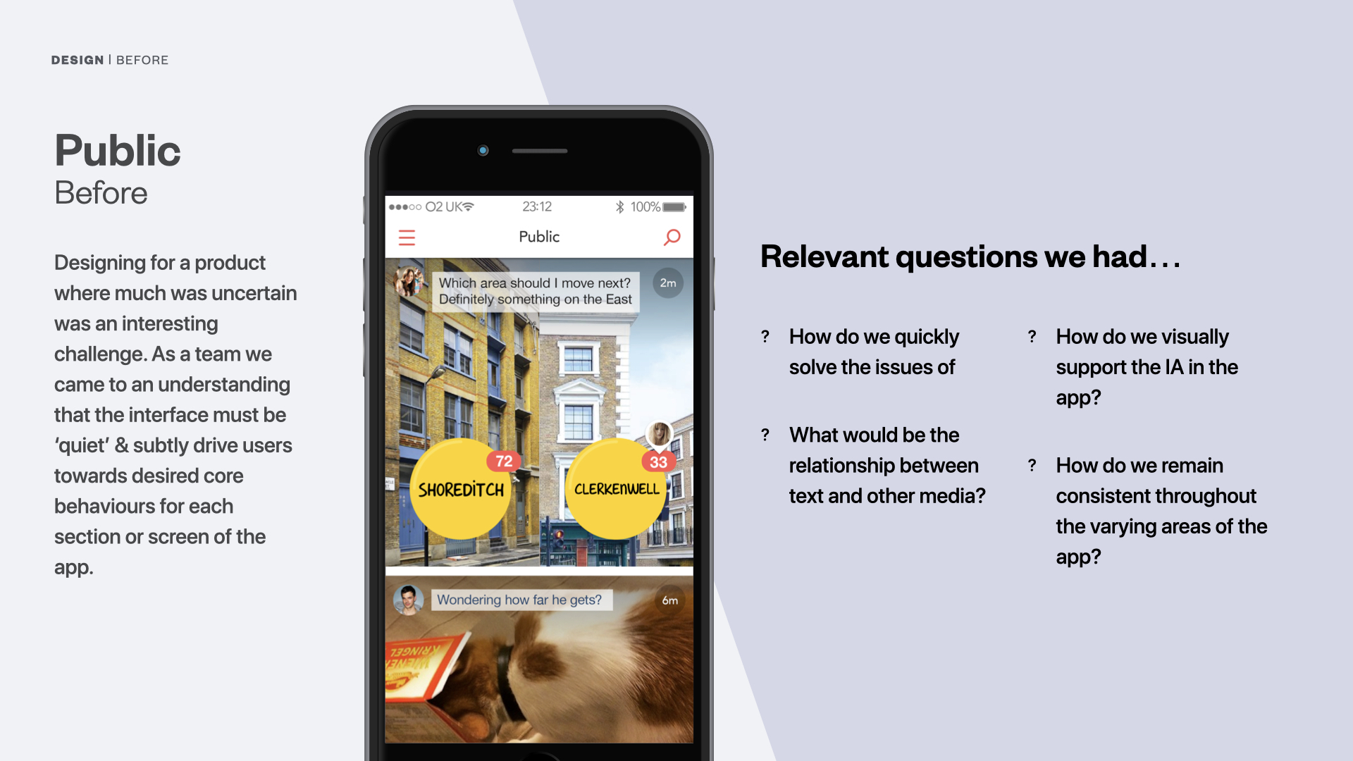
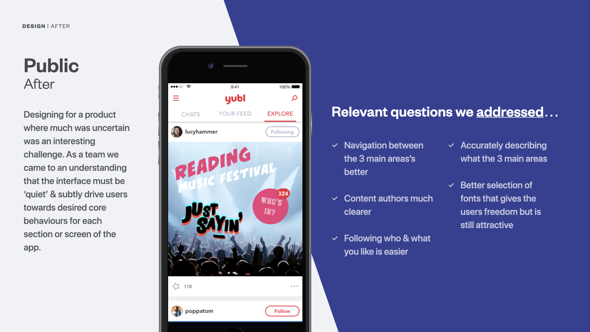
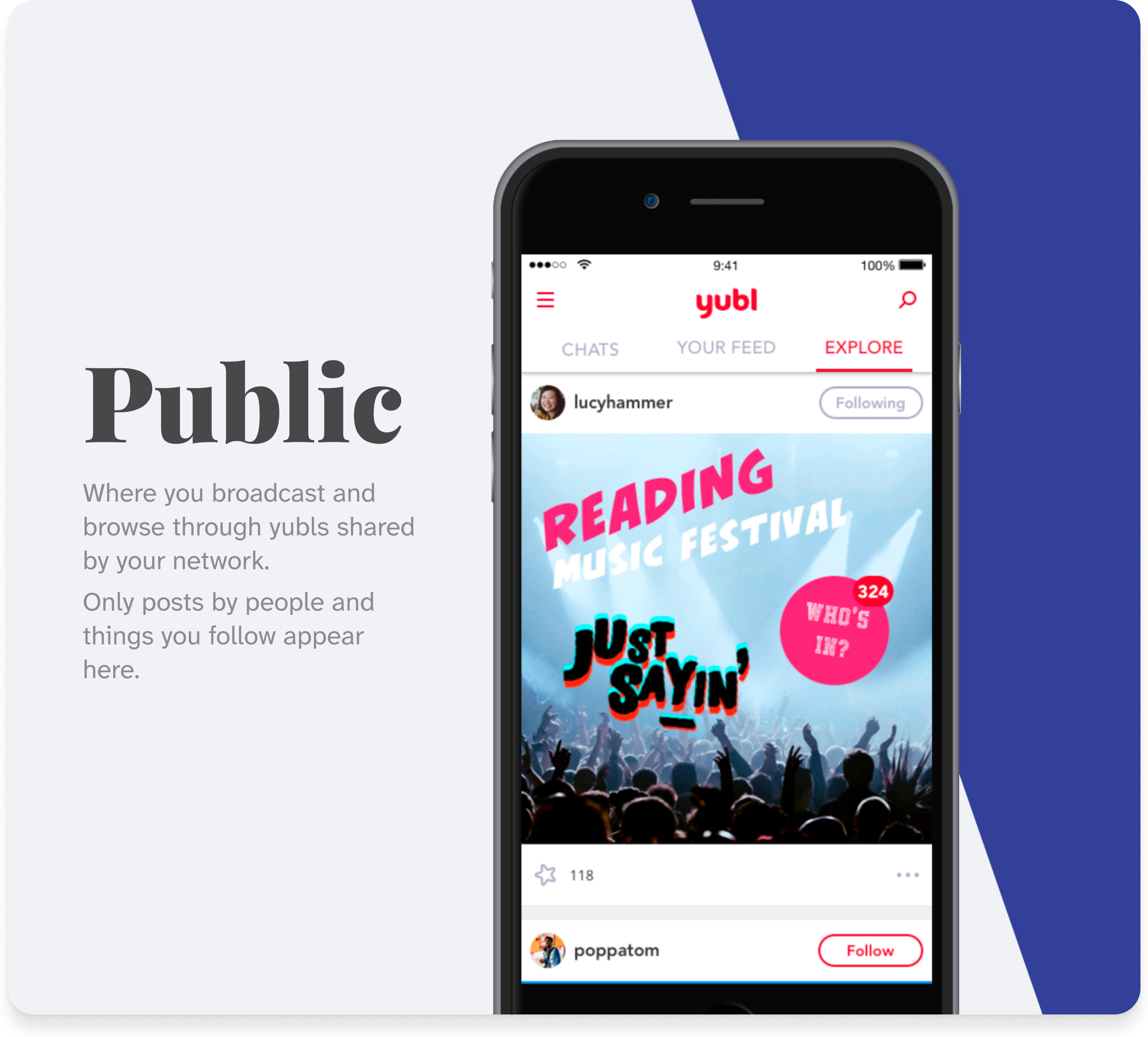
Designed for clarity and content ownership.
Reorganized layout and type hierarchy to make posts feel personal, not generic.
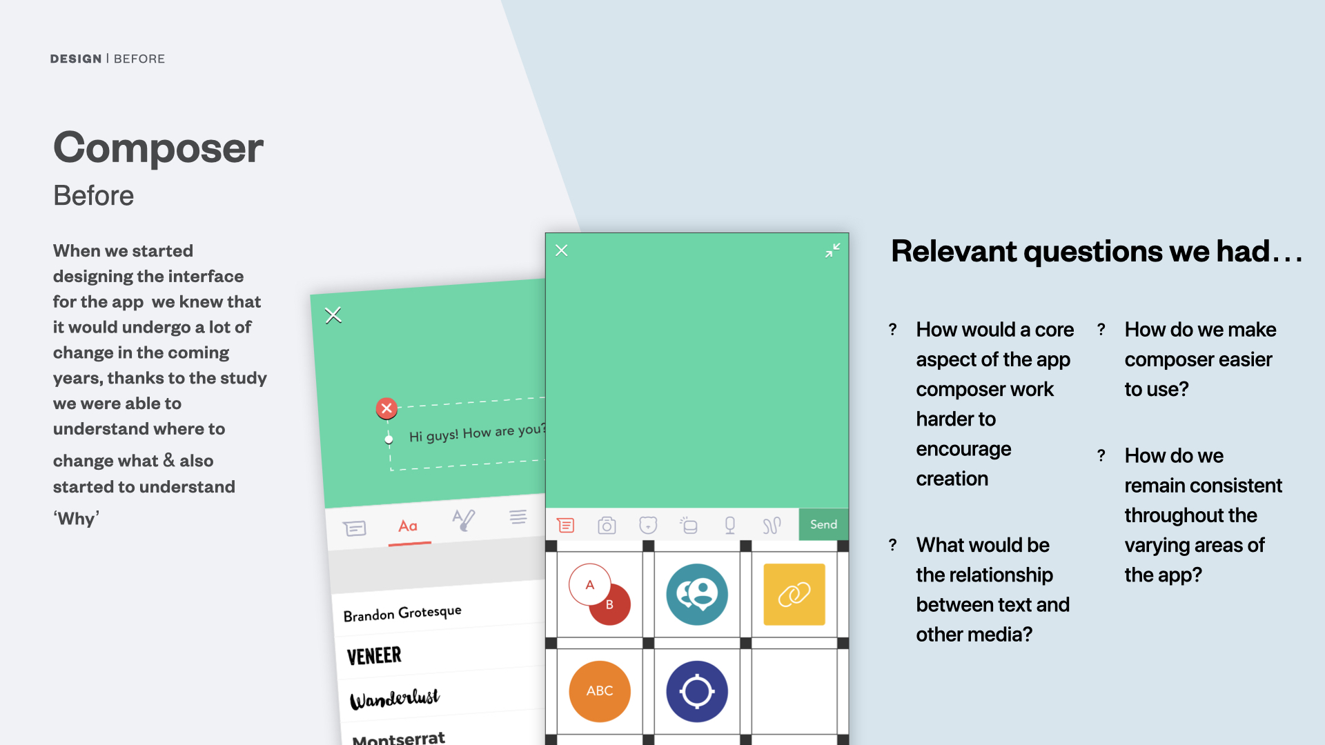
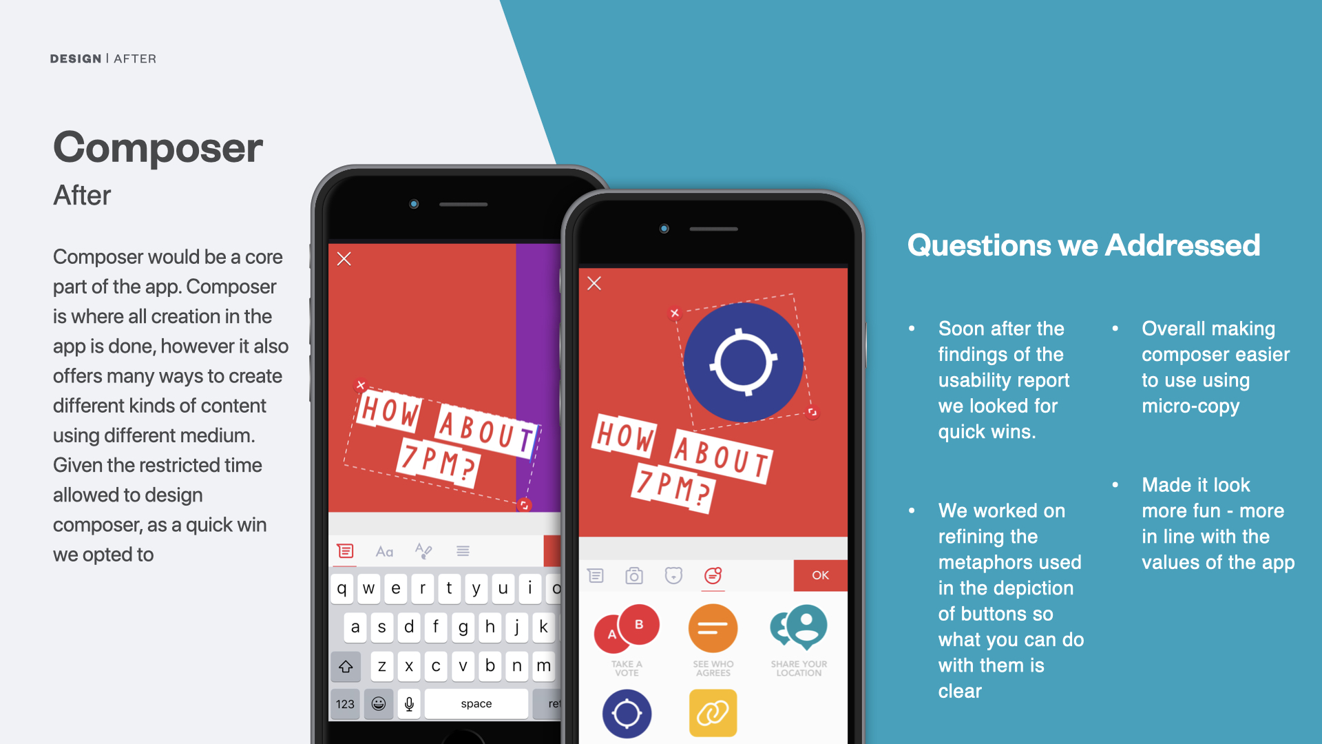
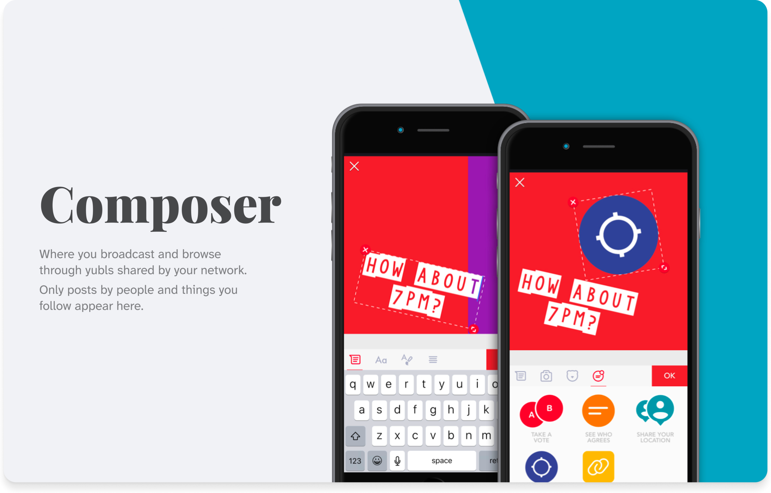
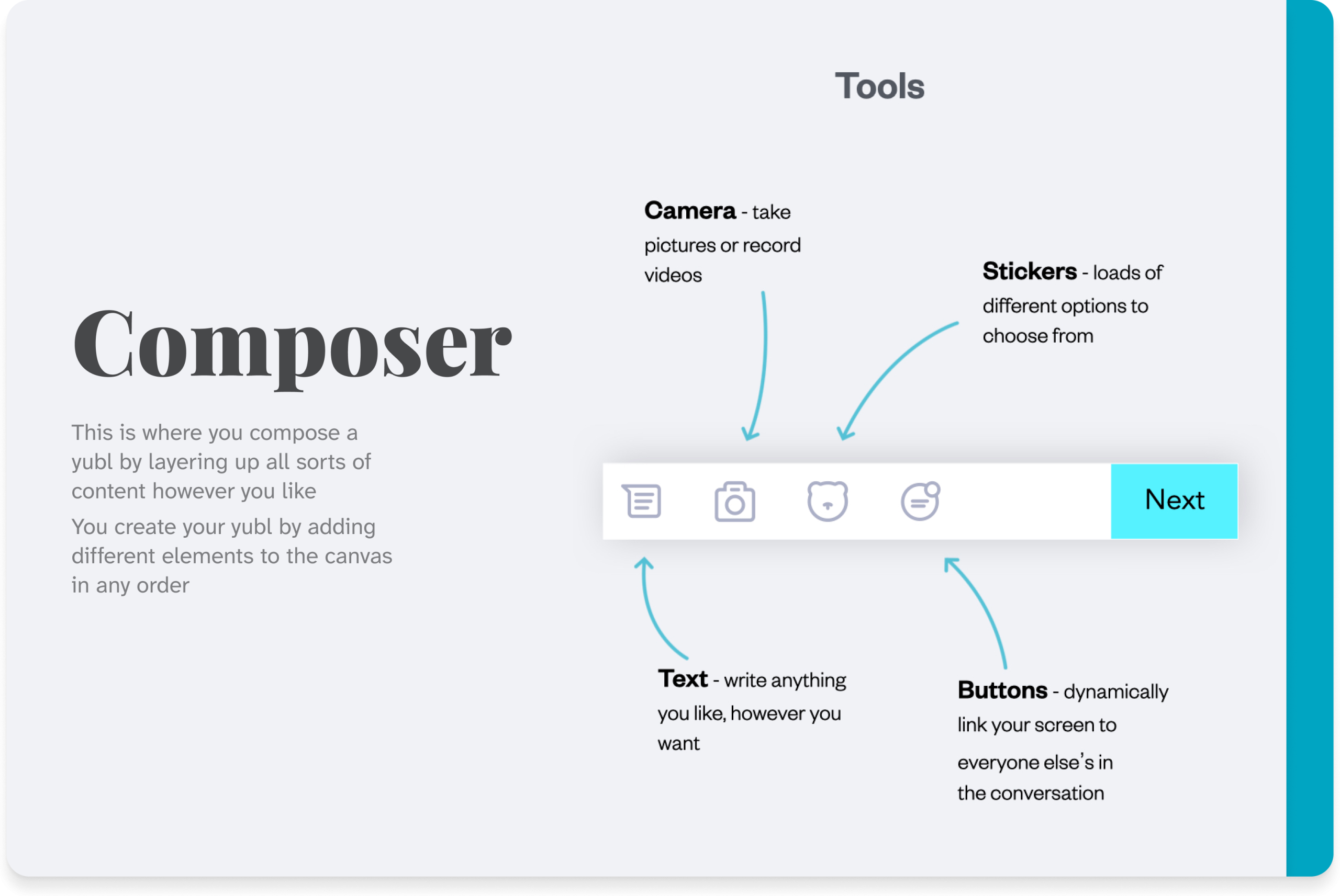
Yubl’s creative engine.
Refined icons, microcopy, and layout to make post creation playful and intuitive.
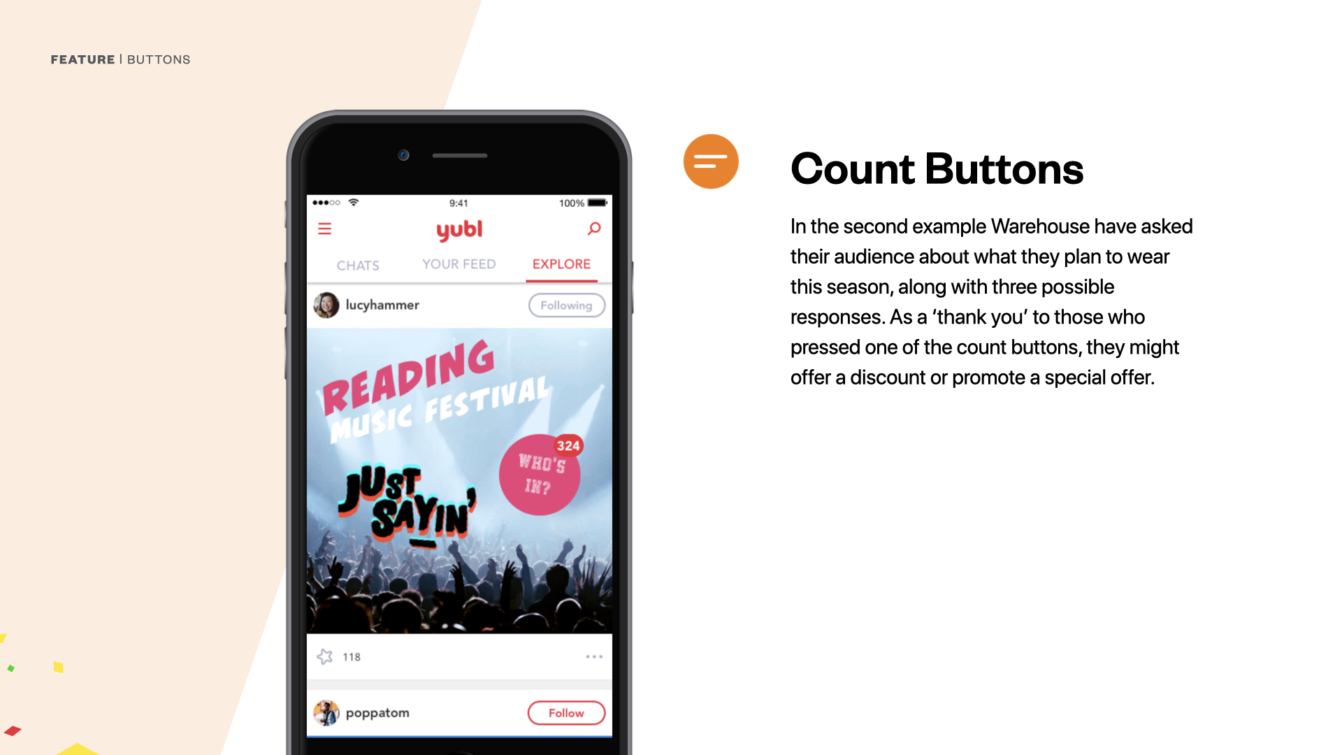
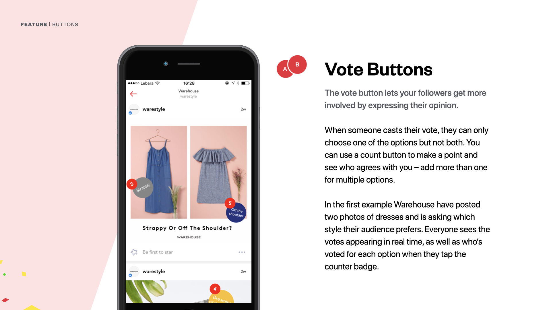
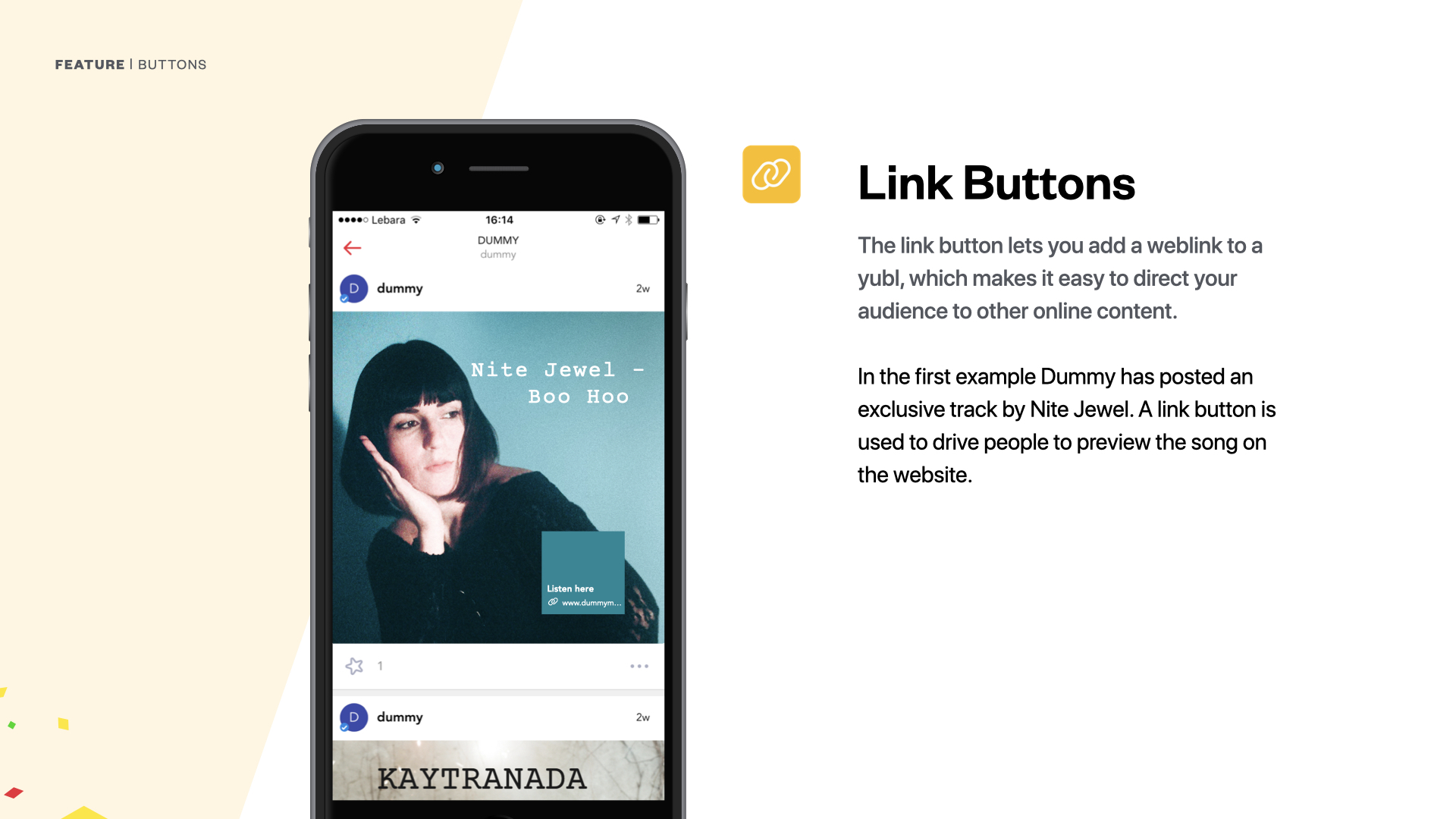
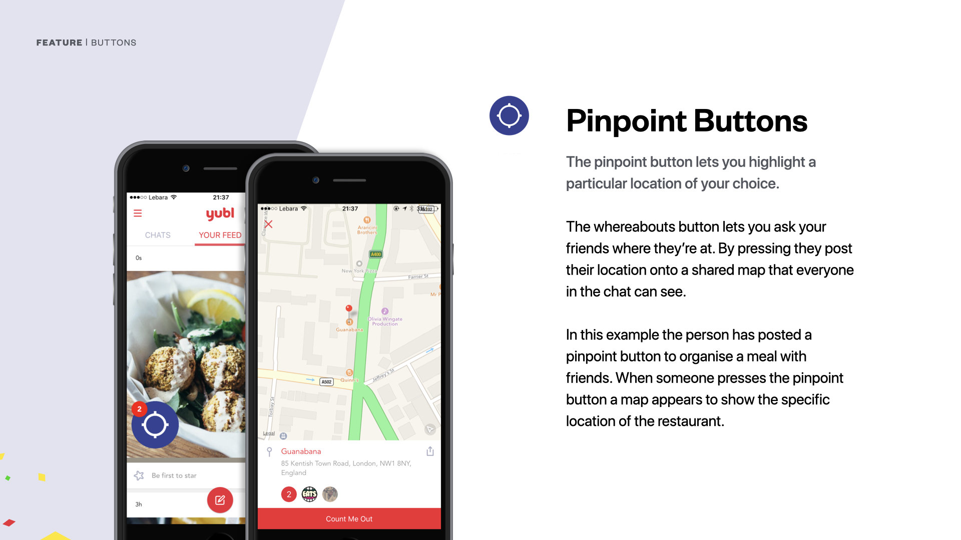
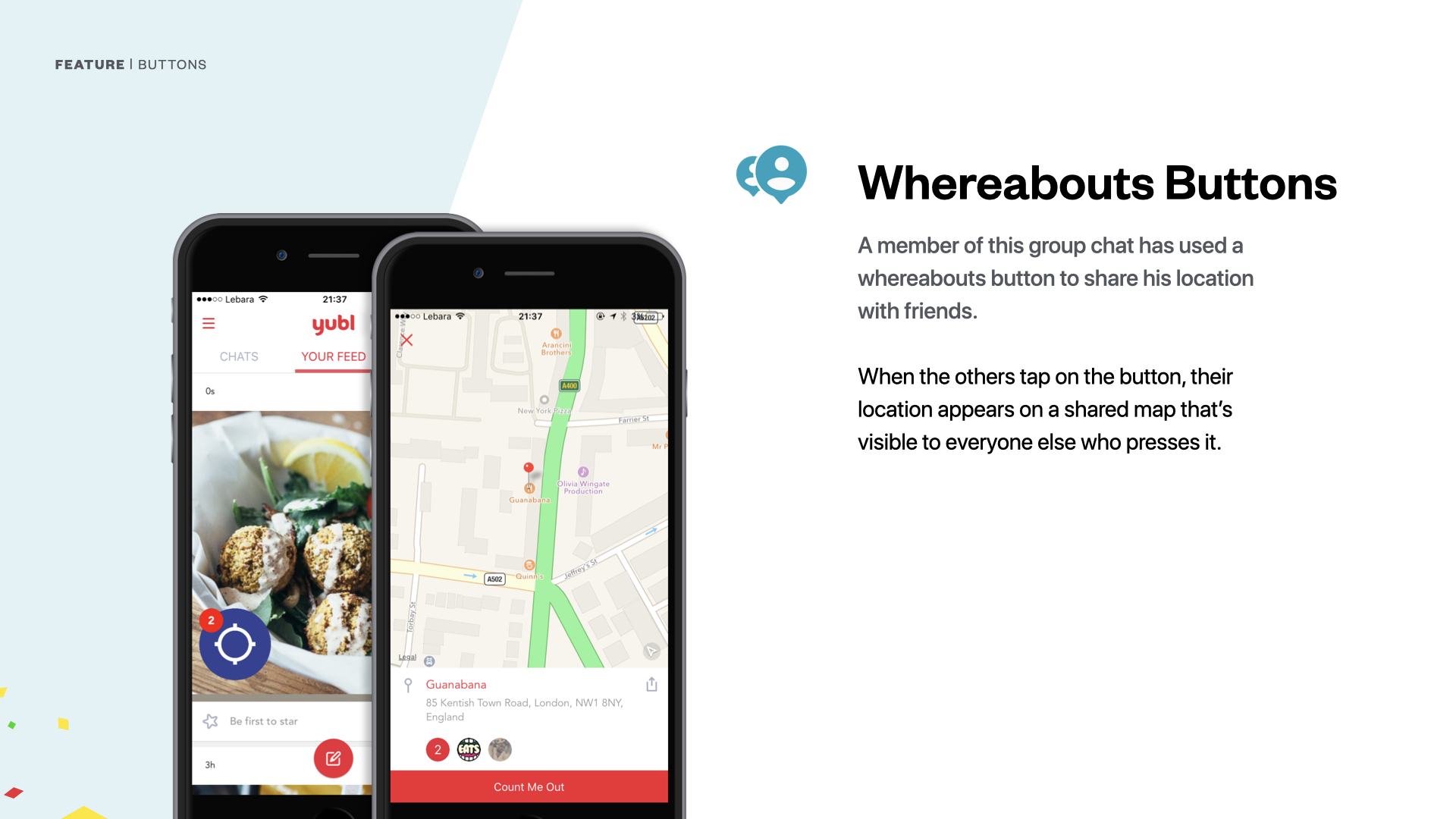
Core to Yubl’s difference.
Designed Vote, Count, Link, and Location buttons to feel native and invite action.
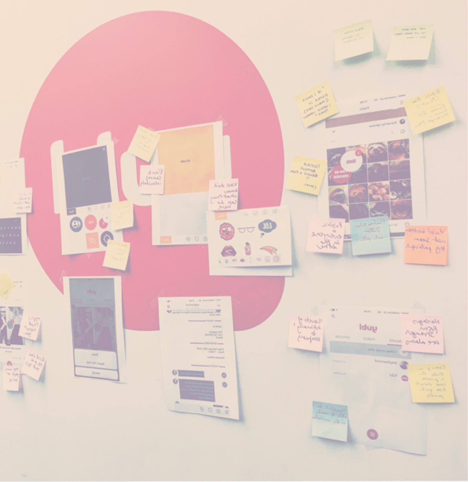
Problem framing
ƒ/5.6 • 135.0 mm • 1/200 (640) • Flash (off, did not fire)
Opportunity mapping
ƒ/5.6 • 135.0 mm • 1/200 (640) • Flash (off, did not fire)
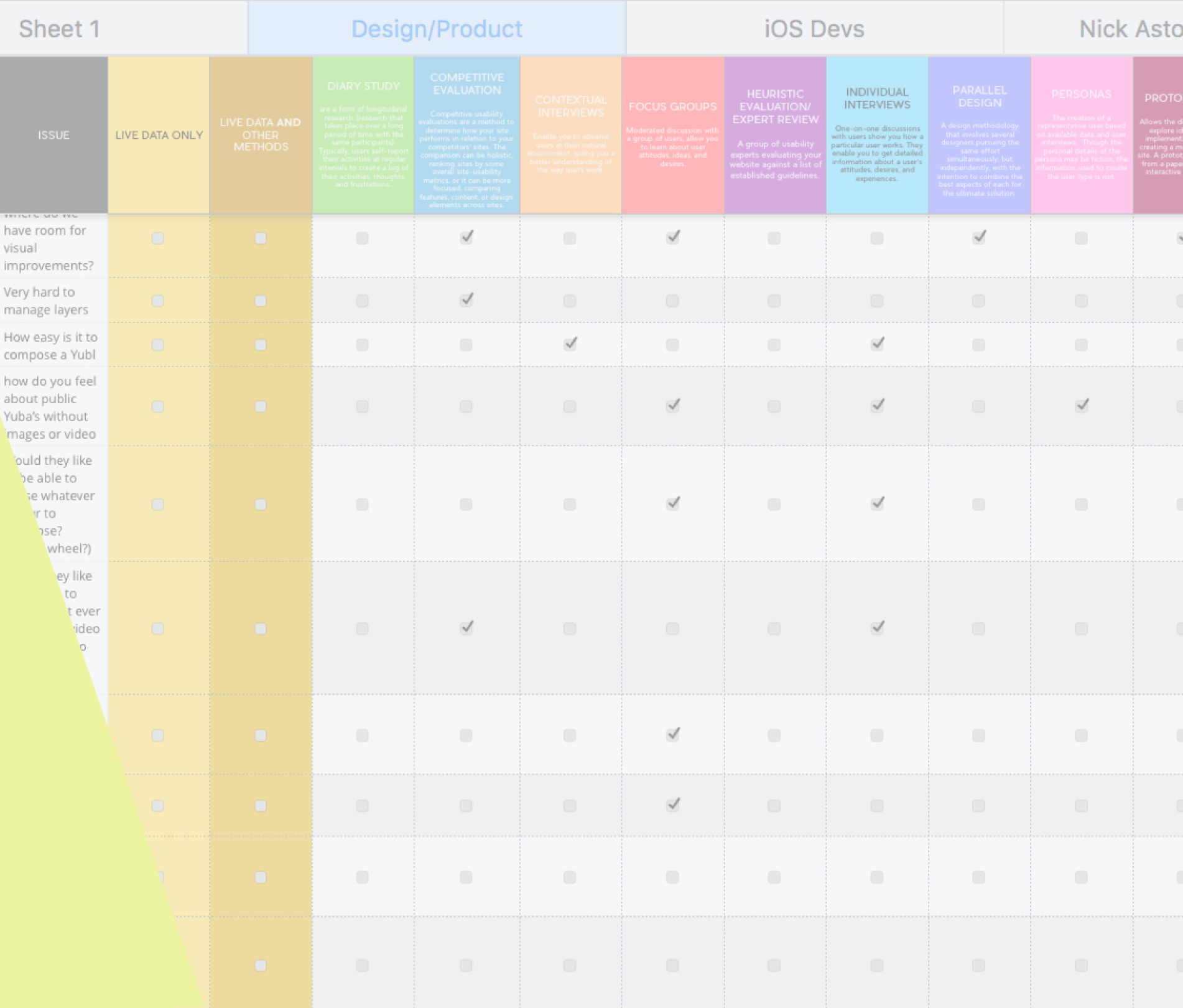
Sythesis
ƒ/5.6 • 135.0 mm • 1/200 (640) • Flash (off, did not fire)
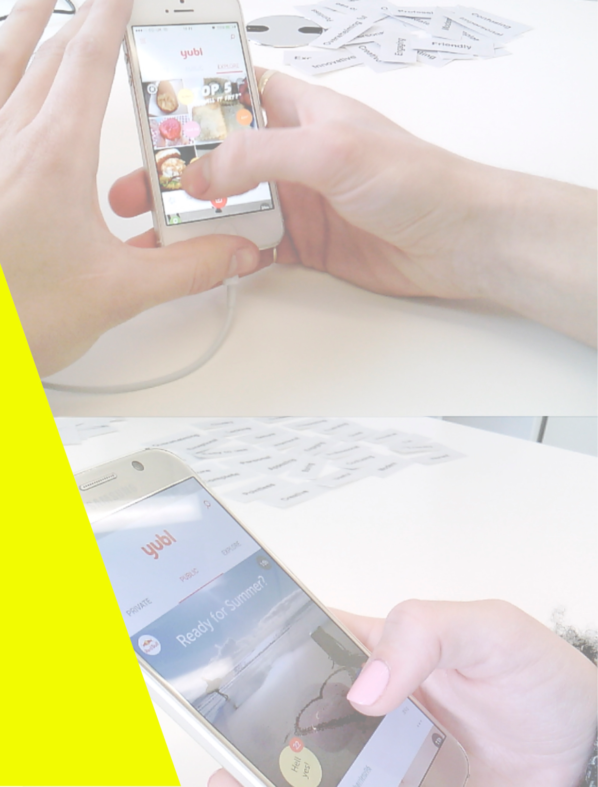
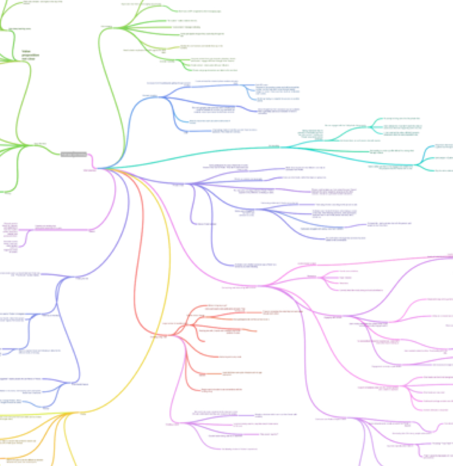
User Testing
ƒ/5.6 • 135.0 mm • 1/200 (640) • Flash (off, did not fire)
Yubl_proj_slides.002 (1)
ƒ/5.6 • 135.0 mm • 1/200 (640) • Flash (off, did not fire)